
GR8 People, The Everyone Platform™, is a multifaceted B2B product designed to help enterprise-level companies attract, manage, and hire talent.
Without a design or product team assembled, the platform had been without design direction. This project was to give a new visual perspective to the platform, apply a user centered design approach, strengthen the branding and develop a process for how we would build consistency.
My Role
Lead Product Designer
I led the redesign effort on the platform usually as the sole designer, sometimes with the help of a junior designer. Worked with Product Managers to collect and refine the requirements and outline tasks. Performed user research in the form of user interviews, market research, created sitemaps, user flows, wireframes, prototypes, and high fidelity designs. Collaborated with development to discuss ideas that would benefit from their input. Presented designs to VP of Product and CEO weekly. Managed all design validation QA and accessibility validations.
Goals
The platform was originally designed in a startup environment, so new features were quick to get shipped. It seemed that the design was often deprioritized to complete features quickly before GR8 People started composing their product team. Coming onto the team as the only designer, the main overarching goal was to prioritize the design of the product with the user in mind, apply design principles that it lacked and make it a little more easy on the eyes and a lot more user friendly.
More specifically, the goals of the relaunch project were to:
- Simplify the UI, making it more intuitive
- Modernize the UI, making it more aesthetic pleasing and current
- Maintain most of the existing functionality but also edit where appropriate
- Perform user research, mostly in the form of customer interview feedback to inform the design direction
- Perform market research to ensure that the new UI and features of the ATS would align with the market
- Design with best practices in mind
- Embrace the GR8 People brand and use it to inform the design system
- Prioritize accessibility best practices in each new component
Solution
The first step in this project was to collect feedback from the users. I set up a script to go through with a group of users. Working with the implementation team, we set up the client interviews, I asked them to guide the interviews so that I could listen and take notes. I also wanted to make sure that none of the questions were asked in a guiding way. In the end we collected a lot of great insight to what kinds of changes the users wanted to see and set some project goals.
Teaming up with the Product Managers to decide where to start, we looked at our user research to decide what screens would be most impactful to start on. Every design decision would inform the product and then also inform other parts of the product so it was vital that we took a strategic approach.
Teaming up with development I formulated a strategy for the design system, how we would validate the design and how we would go about introducing accessibility into our workflow, including the design, the code and also validating it.
There were brainstorming sessions, sketches, and sitemaps if needed. We talked to a lot of our current customers early and often to hear from them about any major pain points, what works for them, what doesn’t work for them.
Redesigned Features
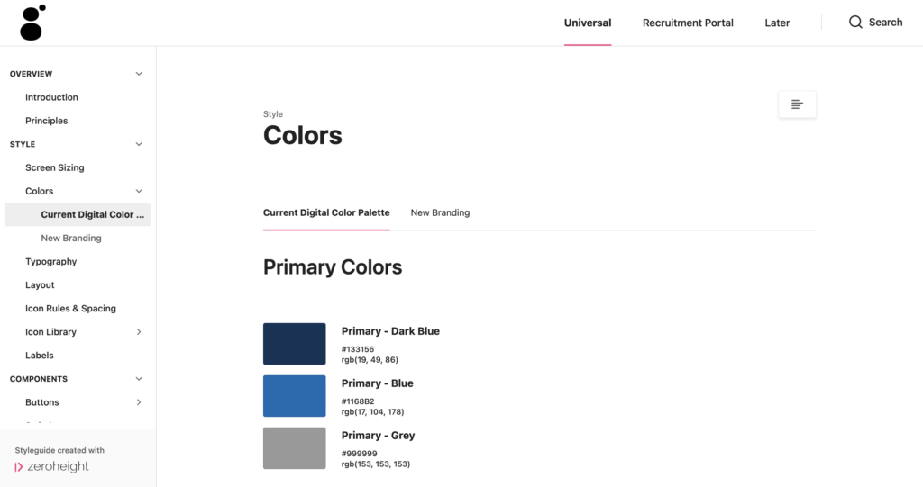
Before starting the redesign there were only three main colors in the platform, white, orange and grey. It was important to introduce more of the branding in the screens overall.
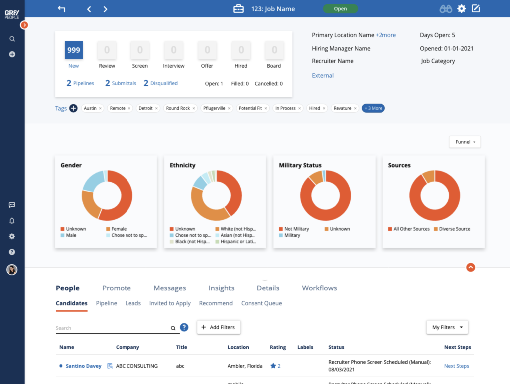
A lot of the pre-existing screens had confusing top sections that were clogged up with too much information so I came up with a system for showing important KPIs in the “top cards.”
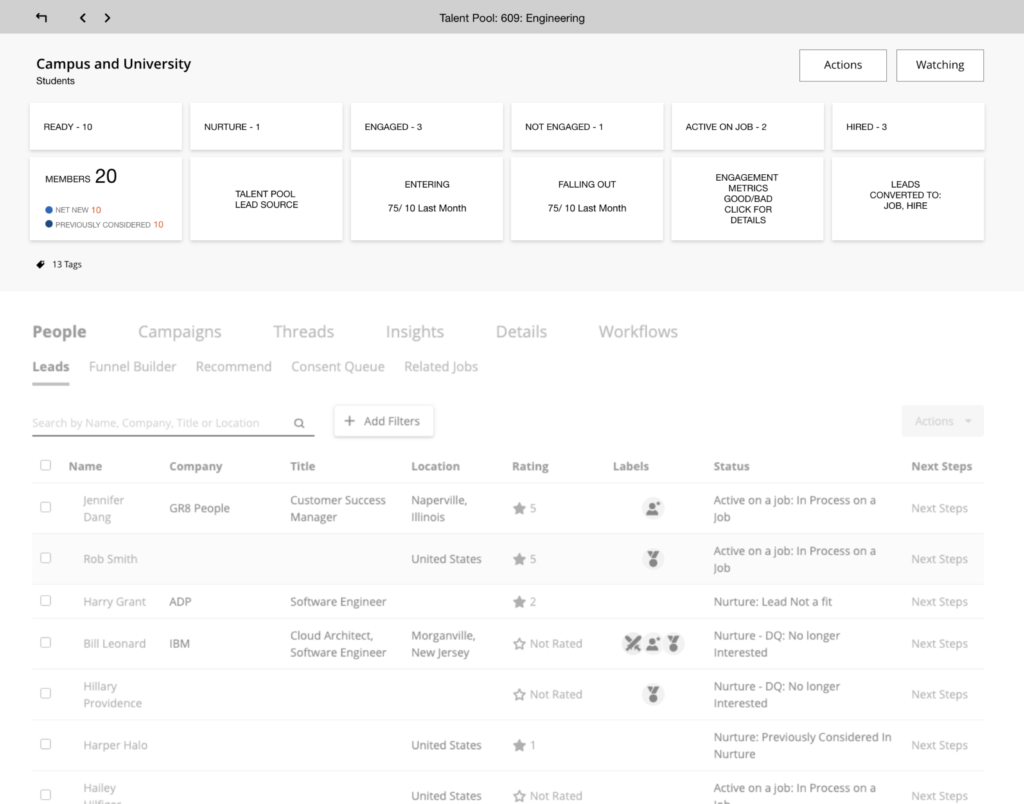
We named a single KPI a “bit” and a group of “bits” were named a “bundle”.

Probably one of the biggest changes in the redesign that affected so many data sets would be the switch from cards of data to a table. Before there was so much information crammed into these cards. They were cluttered, hard to scan, hard to read and you couldn’t really sort them. So, I designed a table that could solve so many of these issues. The CTO called it the “world peace list grid” joking that it could solve all the world’s problems.
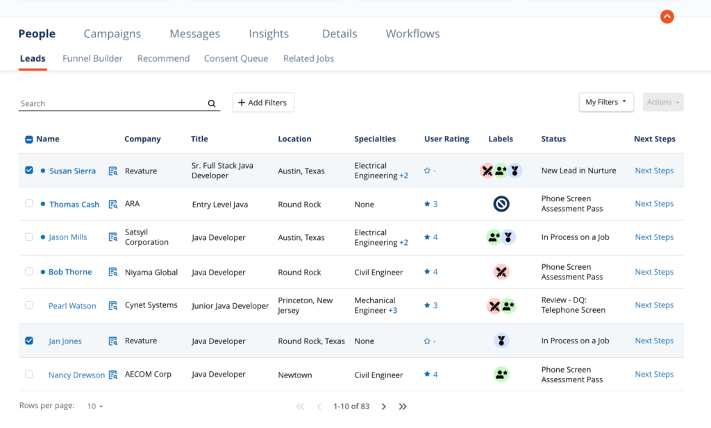
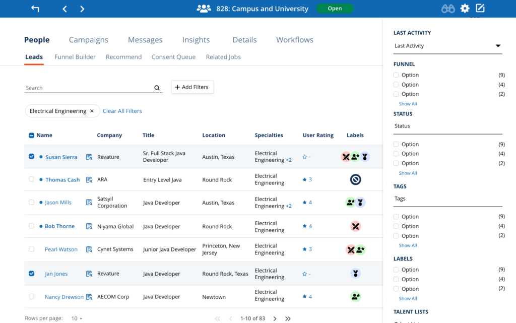
A lot of our user feedback was pointing to them not being able to find people fast enough, or collect the right group of people which resulted in a faceted filter system. I teamed up with development to discuss what the performance implications might be and we got to work on a flexible solution that would be able to span the entire platform as a filtering option.
Final UI
Before giving this design the status of “final UI” we started the practice of adding “design validation” and “accessibility validation” tickets to the projects. This way I would look over the design once it was handed back to Product from Development. It was important for me to make sure that the agreed upon design was honored in the development process to keep everything consistent and that the accessibility of the design was tested to clear up any areas that needed more attention.
The final UI for the Job screen, showing easy to scan top card area with KPIs, some general information, insights below that and then the table data below.
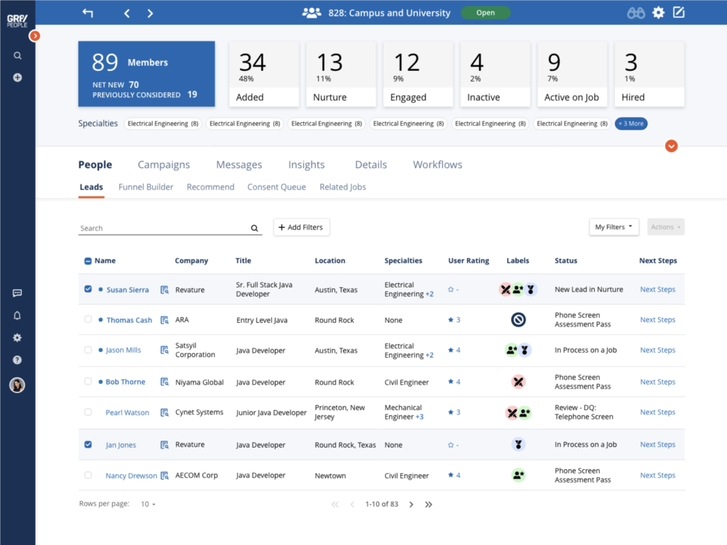
Talent Pool screen that follows the same format, KPIs and then table data below.
Reflection
The customer feedback on the redesigns were really positive. Even though we edited the screens down a bit, there weren’t any complaints about lost data points which confirmed that we had edited the right excess data out.
The task of redesigning a product of this size is massive so the one thing that was a huge challenge was breaking off sections of the product that made sense to work on all at one time without making the project too big. There were times we had to pivot and stop working on the redesign because a new feature would get onto the roadmap, the candidate screen was once put on hold for almost a year. This was frustrating at times to the team.
Although a lot of screens have completed a redesign and those have received amazing customer feedback, I don’t think that I can say that this project reached it’s goals because it is not complete and probably won’t be complete for a very long time.