
GR8 People, The Everyone Platform™, is a collection of products that come together to attract, manage and hire talent. Hiring managers have different tasks and goals than the recruiter. The division of responsibilities between the recruiter and hiring manager can get messy, GR8 People realized a need for a portal exclusive to the goals and tasks of the hiring manager.
My Role
Lead Product Designer
I was tasked to collaborate with the dev team to create a responsive portal for hiring managers. I created a structure for the portal, wireframes to present to dev and other stakeholders, high fidelity designs and prototypes.
Goals
After engaging in some user research sessions, hosting one on ones with some select hiring managers, it was determined that it would be important to explore designing a UI that was would prioritize only their responsibilities. This way, the hiring manager would be able to review potential candidates easily and compare them against one another quickly with minimal distraction.
Hiring managers needed a space to tend to their specific daily responsibilities with minimal noise. A place where they could just sign in and get to work with all the extra functionality, not important to them, muted.
- Better visibility of valuable insights was a priority. Distilled data at a glance is valuable when there are a lot of other responsibilities to deal with throughout the hiring manager’s busy day.
- Provide the hiring manager with a clear to-do list of all of their most important outstanding tasks.
- The portal needed to be mobile-friendly so that it could be accessed their tasks and candidates from wherever they were.
- Lastly, the hiring manager portal would have to work seamlessly with the ATS system so that the data could move through the workflow easily.
Solution
Simplification came with some reorganization of the portal, making sure that everything was very clearly laid out and easy to navigate through. Starting with an inventory of screens to include and a comprehensive site map was an important foundational step at the beginning of this project.
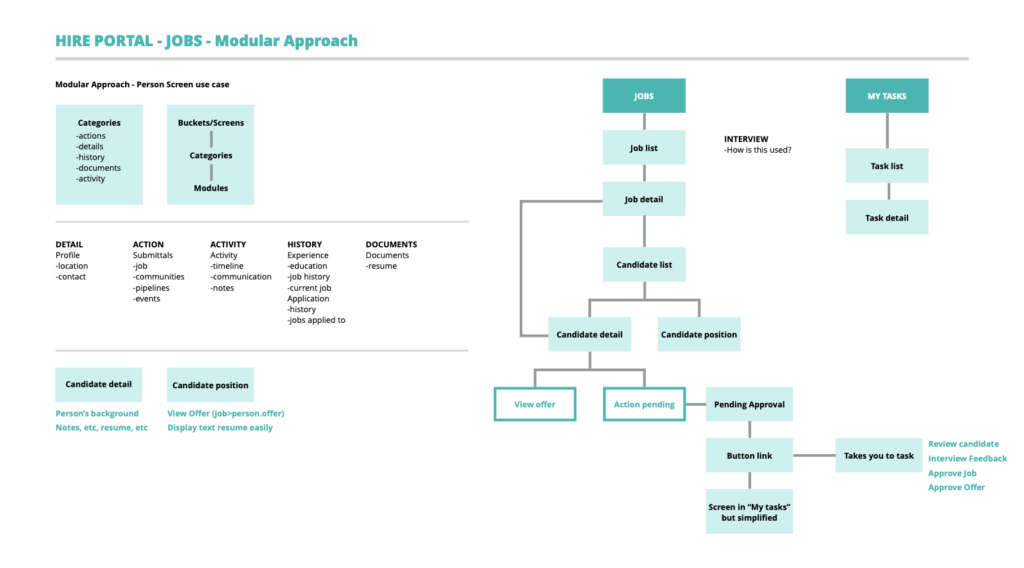
Clear Task Lists (Wireframes)
After our discussions with hiring managers we determined that the task list was a valuable component to the success of this portal. We wanted to simplify the tasks into a very digestible UI, making the tasks easily actionable.
Adding some simple filtering choices to the top of the screen would allow for the user to find certain tasks faster. We also tried to reduce cognitive load by serving them in individual cards so that the information was easy to scan.
The Upcoming tasks section would let them know what tasks were the tasks that were coming up soon that would need their attention, usually interview related.
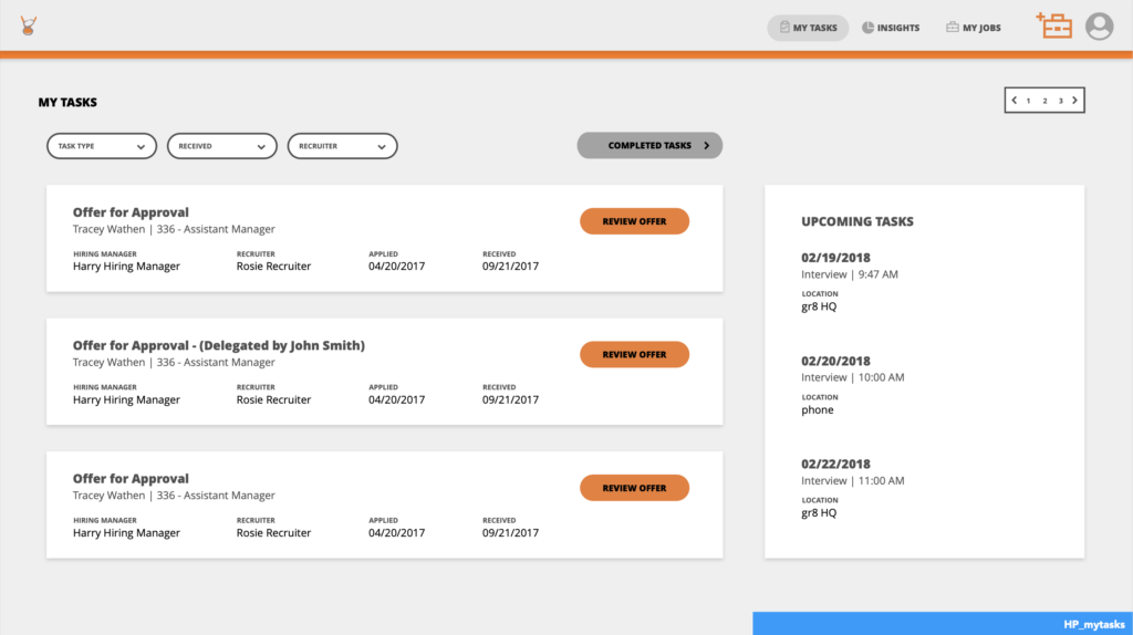
Moving the “completed tasks” to a secondary screen was also a way to reduce the on screen noise. They can still access their completed task history but they are relocated to another screen behind a click.
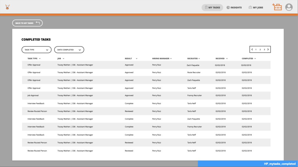
Process Steps at a Glance (Wireframes)
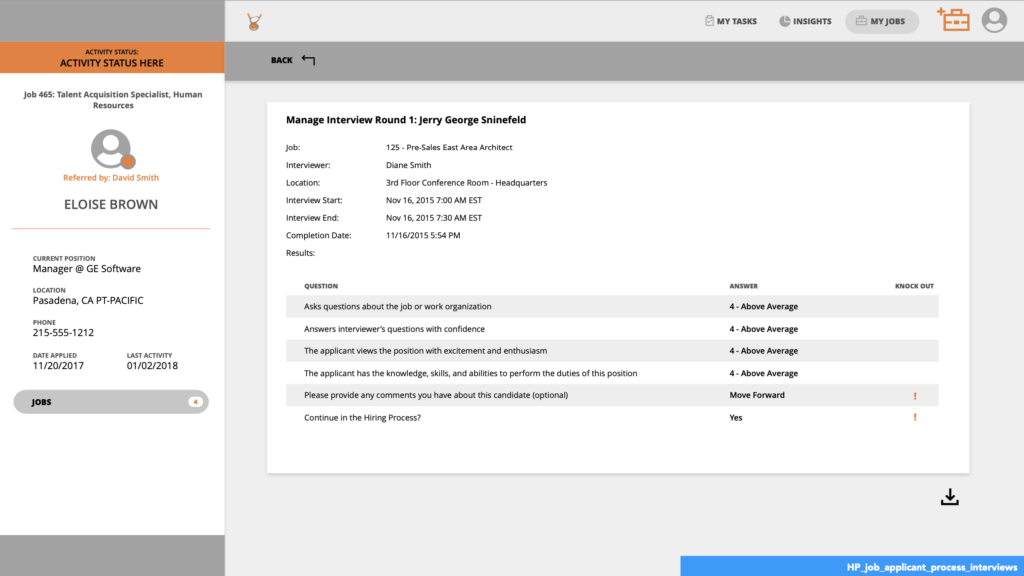
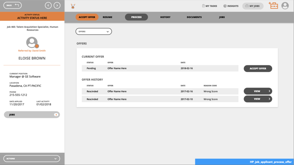
The hiring managers we talked to mentioned that keeping track of where the candidate was in the process was difficult at times so we simplified the UI for this with an easy to follow progress bar. We divided the screen between the personal information on the left side and kept all the “person in process” information on the right side so that the user knows where to look to get whatever information they need to on the candidate.
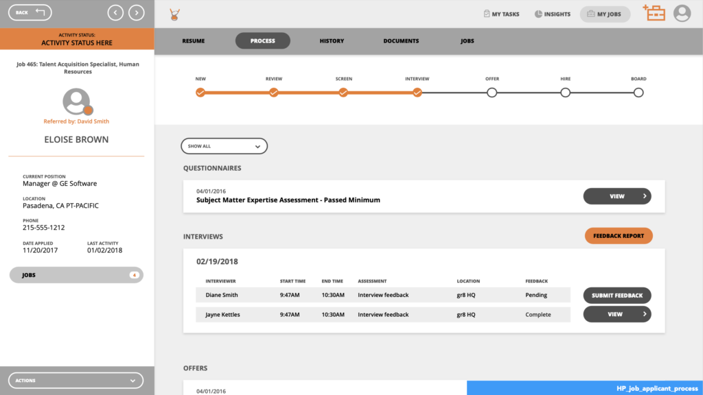
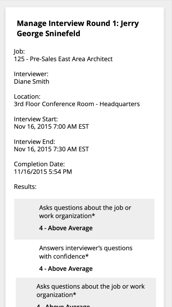
To make the information easier to read and scan at mobile view, we used collapsing table rows. The information condensed into a nice little card view so that the user can scroll and read with ease.
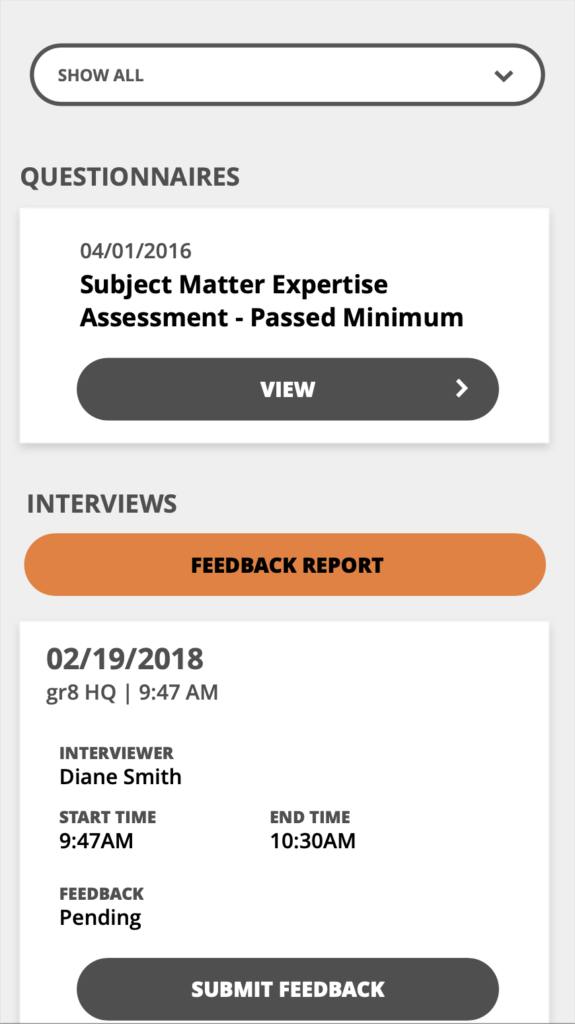
There is so much information in the candidate hiring process to contain within the portal it was important for us to remain focused on making the cognitive load of each screen balanced. Sometimes we purposefully hid secondary screens or behind a click so that the parent screen wasn’t overloaded with information.
Resume Quick Compare (Wireframes)
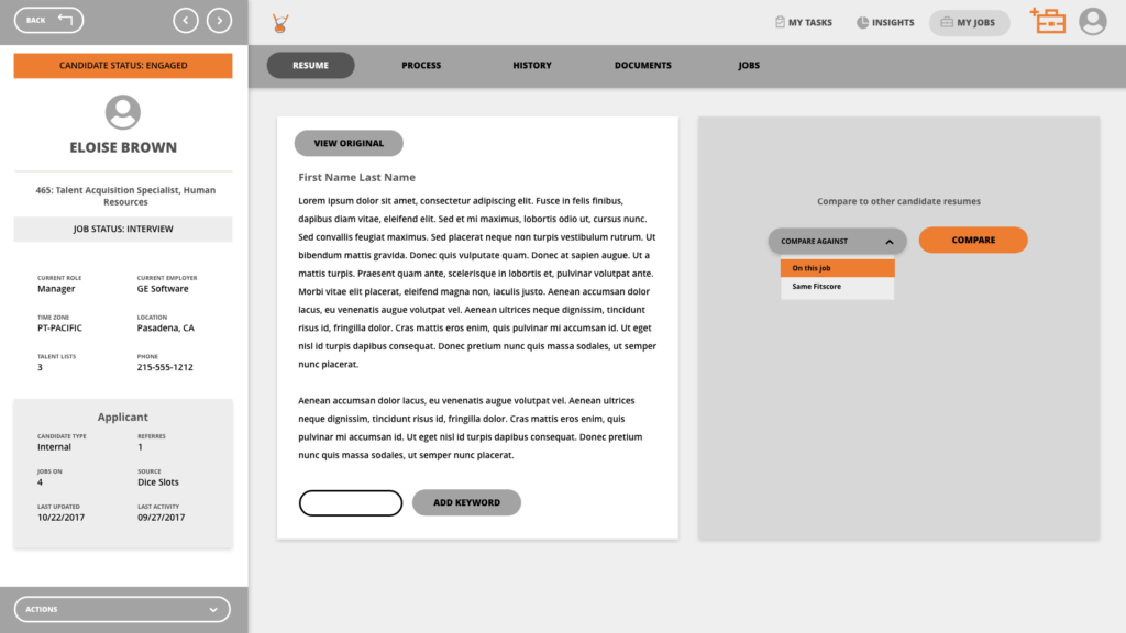
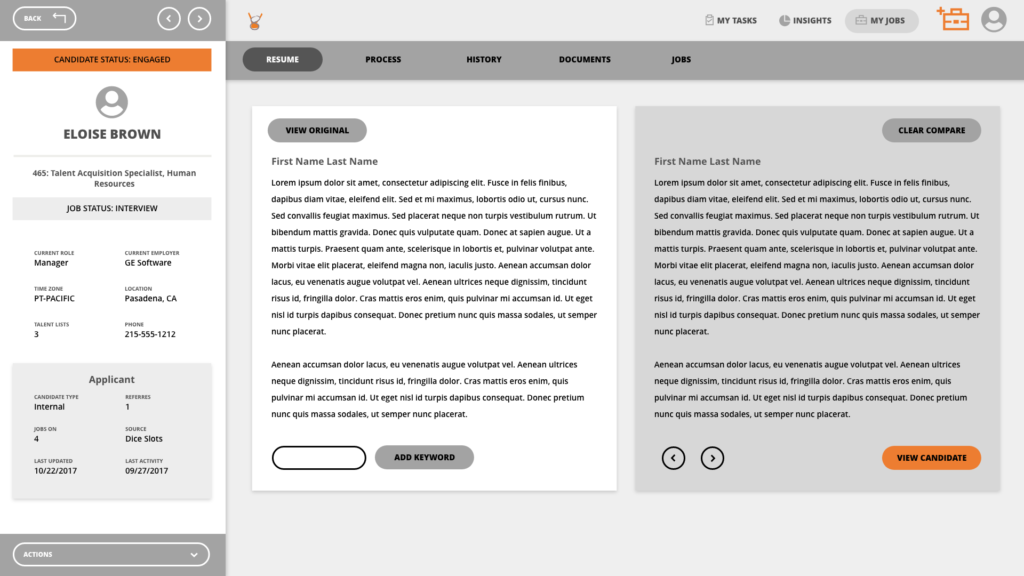
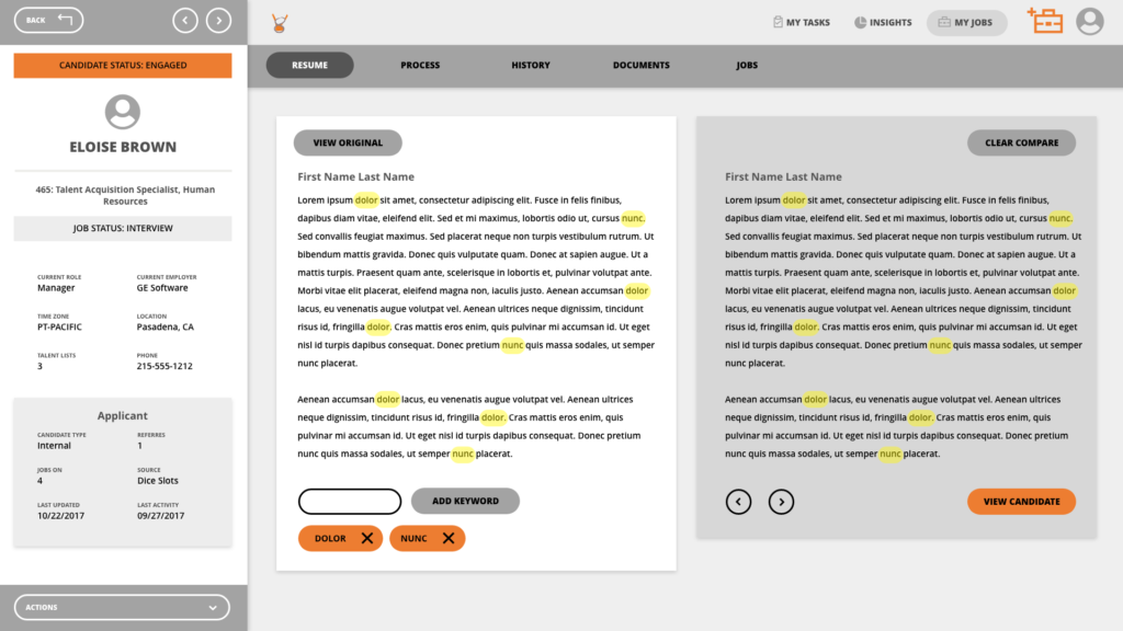
A quick resume comparison tool was designed that would allow hiring managers to find the right candidate faster. They could compare one candidate against other candidates from a certain talent pool. They could also compare different keywords that were specific to the needs of a certain role.
Final UI
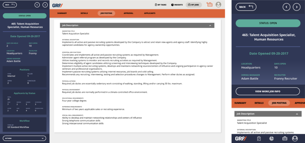
The final UI took on the new branding of the product. We really wanted the personal information side panel to feel separate from the person in process side of the screen so we used contrasting colors to help that feel like it was weighted to the side, more of a permanent element.

Reflection
After building this portal we were able to talk to follow up with feedback from hiring managers to see how the portal was improving their work process and if there were any pain points they noticed. Everyone we asked said that it was great to have a space just to themselves for their tasks and that it was helpful all around. They also gave us some feedback on the person information panel on the right side of the page, which we were able to iterate on and we also added more insights that were requested to the insights panel as well. We added a few more data points that they wanted to see.
Later reflection: Since originally designing this, I think that an interesting exercise could be to explore how AI might be used in the resume comparison section to lighten the load of the user having to input the keywords.