
Problem
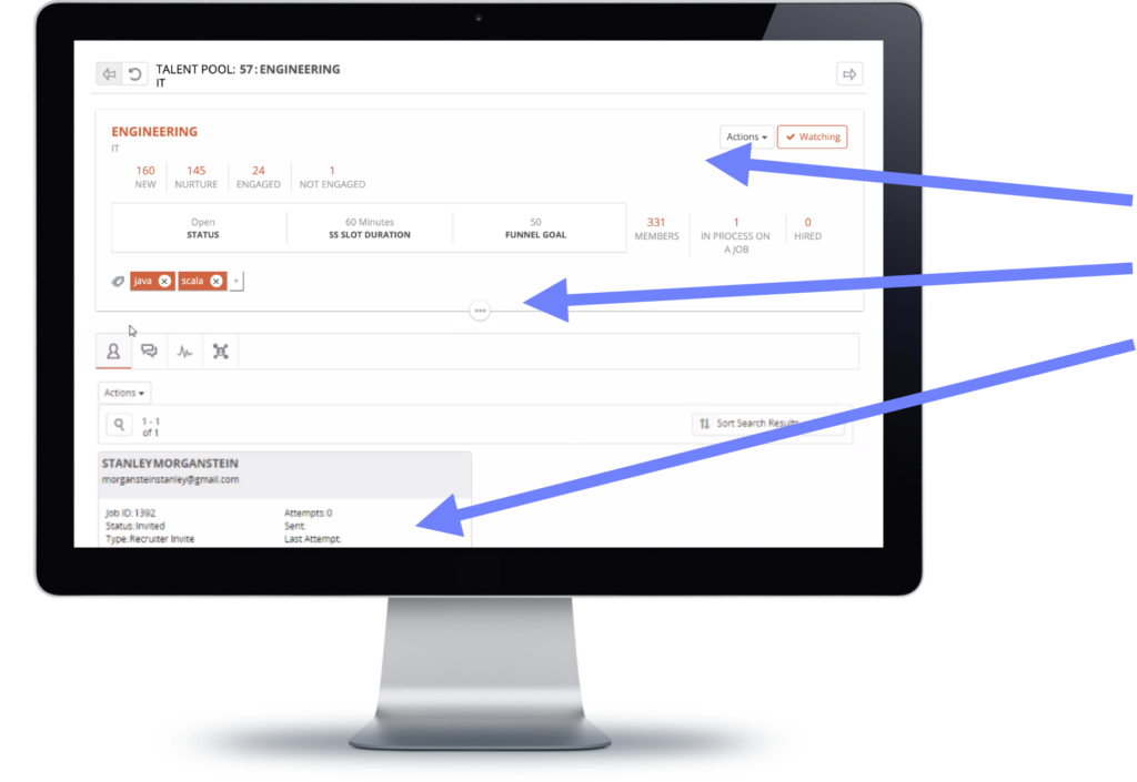
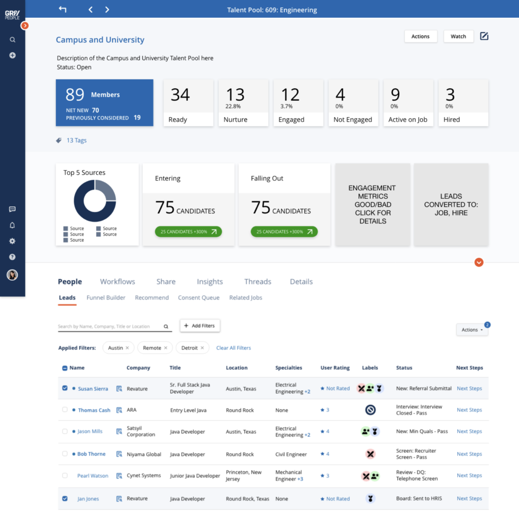
The talent pool UI was causing a lot of friction for the users trying to view helpful data, at a glance, about their talent pools and organize their candidates quickly and efficiently.
The most important function of the GR8 People platform is to collect and move talent through the hiring funnel.
The recruiter’s talent pool should be where they can easily collect and introduce talent into the hiring funnel.
ROLE:
Solo Product Designer – discovery, user research, design, testing/validation
TEAM:
1 Product Manager, 3 Engineers, 1 QA Engineer
TIMELINE:
6 Months to complete top card area and first tab content in on-screen menu
BRANDING:
GR8 People, The Everyone Platform™, is a multifaceted B2B product designed to help enterprise-level companies attract, manage, and hire talent.

How might we simplify and organize the information displayed in the talent pool UI so it is more informative and intuitive, helping recruiters move the right candidates along in the hiring funnel faster.
User Research/Feedback
“I can’t see the health of my talent pool at a glance, the data is getting lost at the top of the page”
“I want to get to the right candidate faster”
“Taking action on candidates needs to be easier”
Proposed Solution
01
Display KPIs clearly at the top of the screen for at-a-glance health checks on the talent pool
02
Create a better way to display candidates so that they are scannable, sortable and filterable so the recruiter is interacting with the best option candidates
03
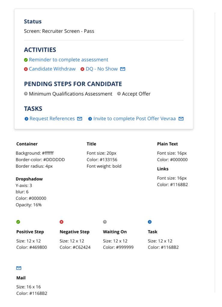
Make taking an action on a candidate super simple
Worked with the product manager to determine what we should prioritize, we ended up dividing the project into three parts, the top card, the list grid and the modular KPIs tray.
Principles
Cultivation & Refinement
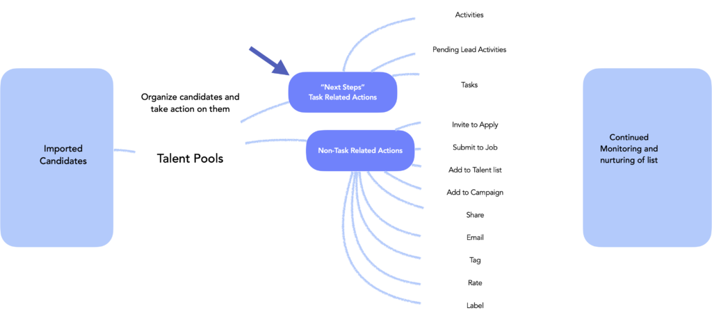
We need to keep in mind that the talent pool should be a living list. Candidates will be moving in and out of it frequently so it will need the ability to evolve.
Respectful of time
The recruiter’s time is split between many different tasks and monitoring and managing their talent pool should be made as simple as possible. Make checking on the overall health of the talent pool to be very obvious.
Flexibility
Recruiters might have different expectations for how much data they want displayed. Make the cognitive load flexible.
Opportunities in the User Journey
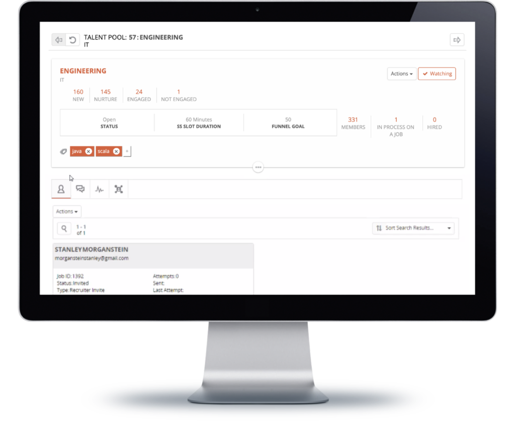
Design Exploration – KPIs
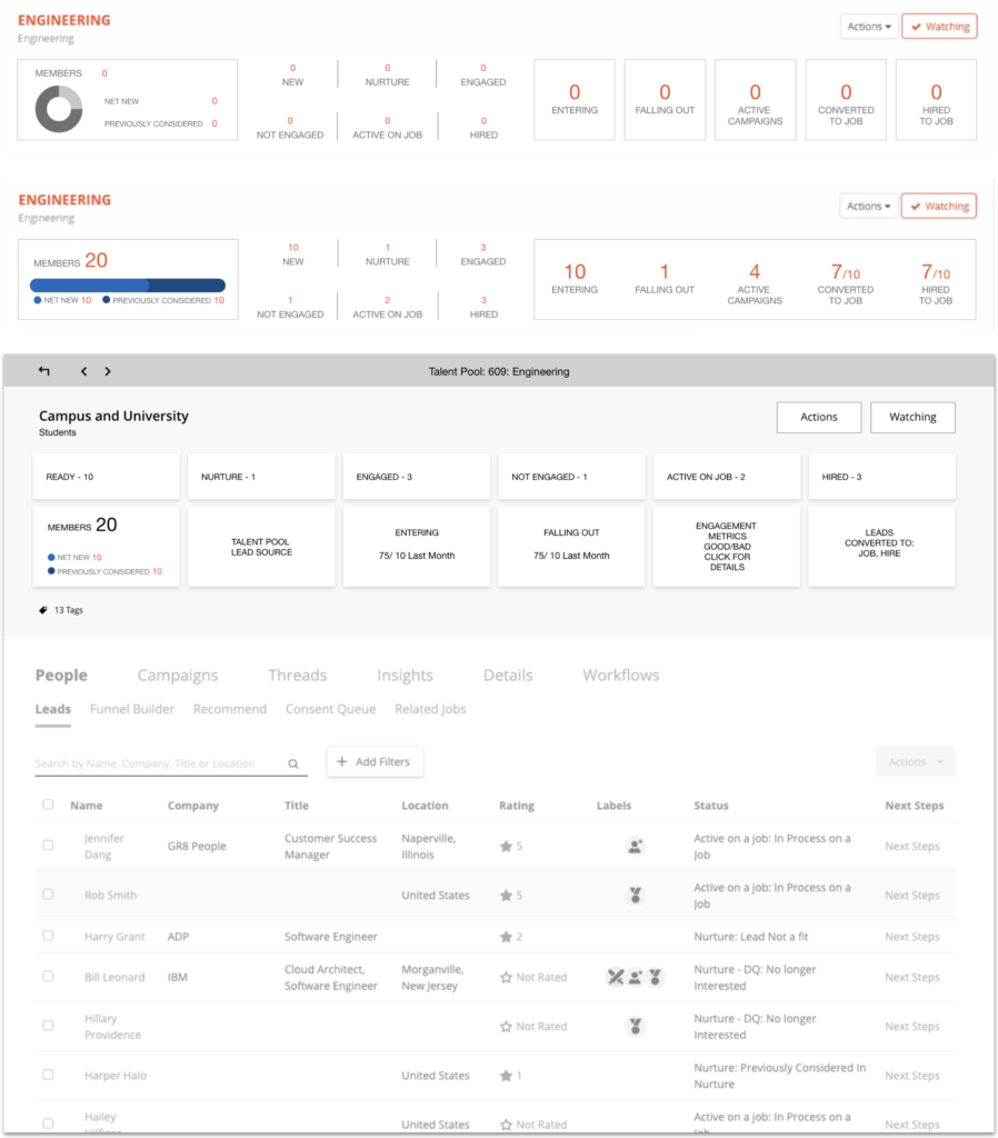
Final Design
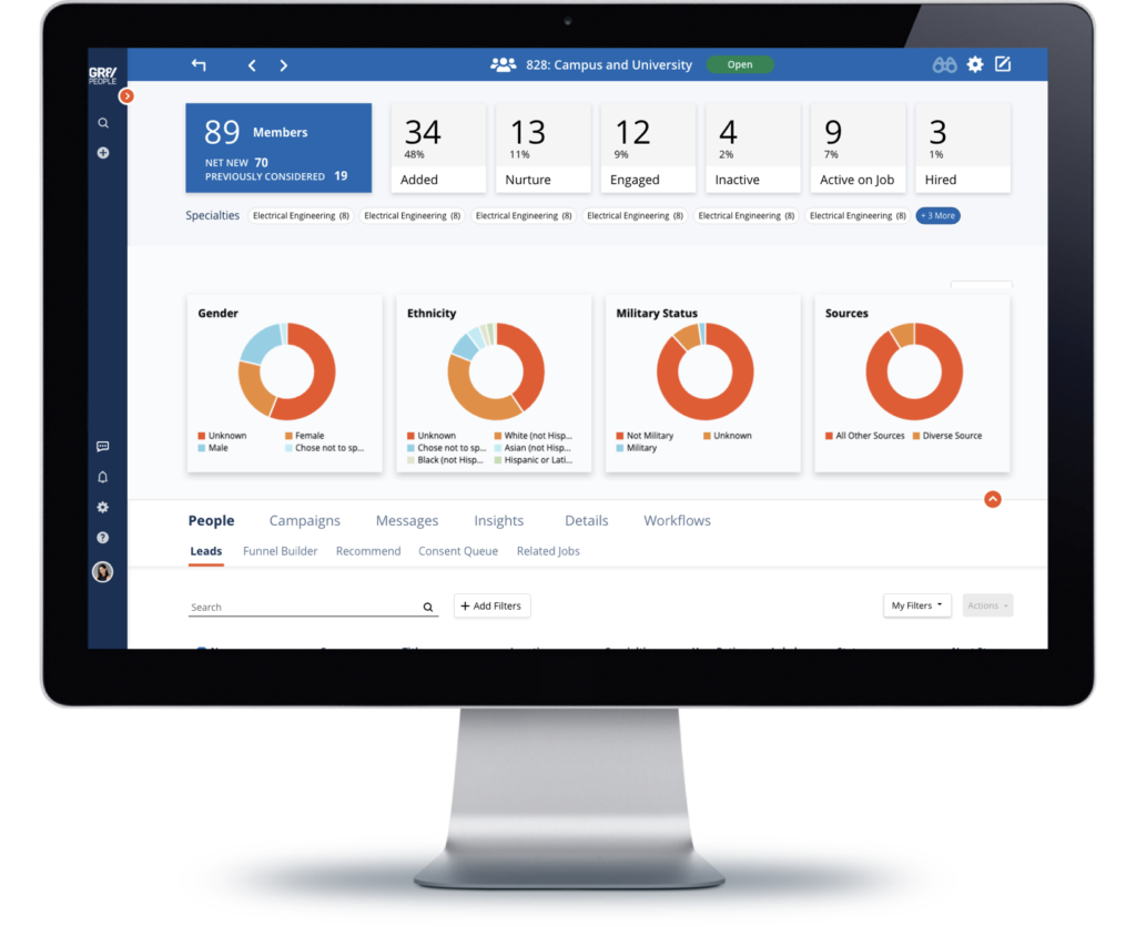
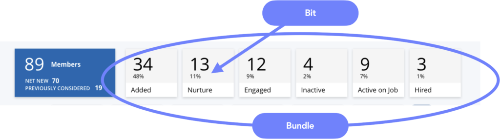
KPI Tray
Next Steps
Refining Search with Facets
Handoff
Design System & Process
Components were designed and handed off with well documented styles, documented rules and any assets needed. The engineering team worked on components that I validated in Github and/or after published to Storybook and then one last time in the final UI, checking each time for both design consistency and accessibility before shipped.

Reflection
Significant increase in talent portal engagement from customers
“I can’t see the health of my talent pool at a glance, the data is getting lost at the top of the page”
Fastest user adoption of any new feature ever published with adoption rates 3x higher than any other feature
“I want to get to the right candidate faster”
Positive customer feedback on action window ease of use
“Taking action on candidates needs to be easier”