
GATTEX is a prescription medicine used in adults with Short Bowel Syndrome (SBS) who need additional nutrition of fluids from intravenous feeding because a large portion of their intestine has been removed by surgery.
Shire needed a digital sales guide to help sales representatives describe the importance and benefits from their product.

My Role
My Role: UX Designer
I was helping to create a digital sales aid for GATTEX for pitch to the client to earn their business. My role was to distill user case studies, guiding the team in group white boarding sessions, create wireframes and participate in presenting them in the pitch to the client.
Goals
Create a digital sales aid on the iPad for sales representatives to detail important information about GATTEX to healthcare providers.
The client expressed that the sales force might show resistance to digital detailing. There was importance placed on ease of use of the application and intuitive UI elements were a must. Certain UI elements would need to be maintained in the GATTEX sales aid.
that were already present in other sales aids used by the same sales force detailing other products (Lialda).
The Solution
Site Map
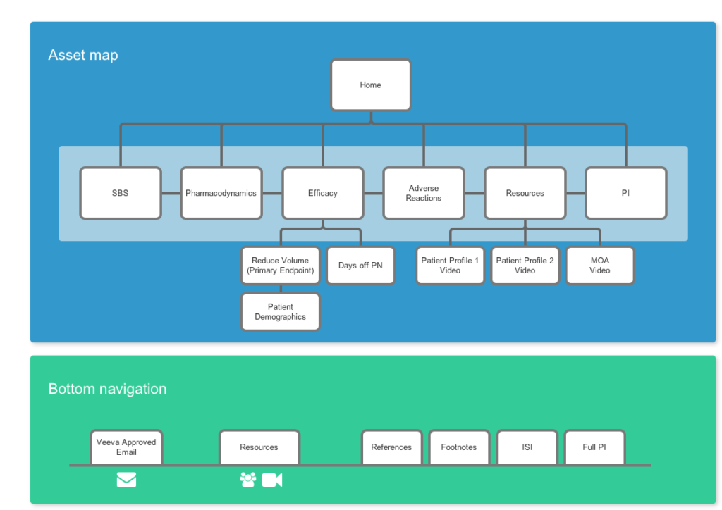
Site maps allowed the team to capture all of the content and organize the assets so that the presentation could start to take shape. This sales aid was to be minimal and easy to use.
The hierarchy of the presentation was considered and documented in the site map. The navigation that lives at the bottom of the screen was considered in this phase as well.
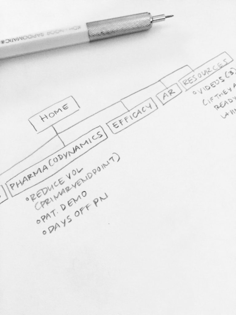
Finished Site Maps
Wireframes
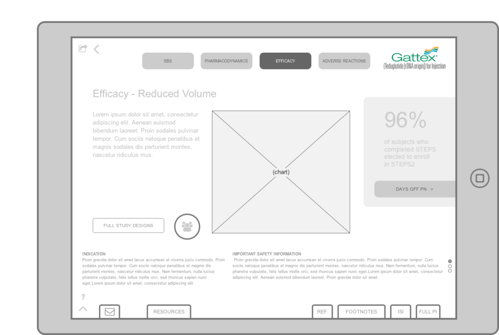
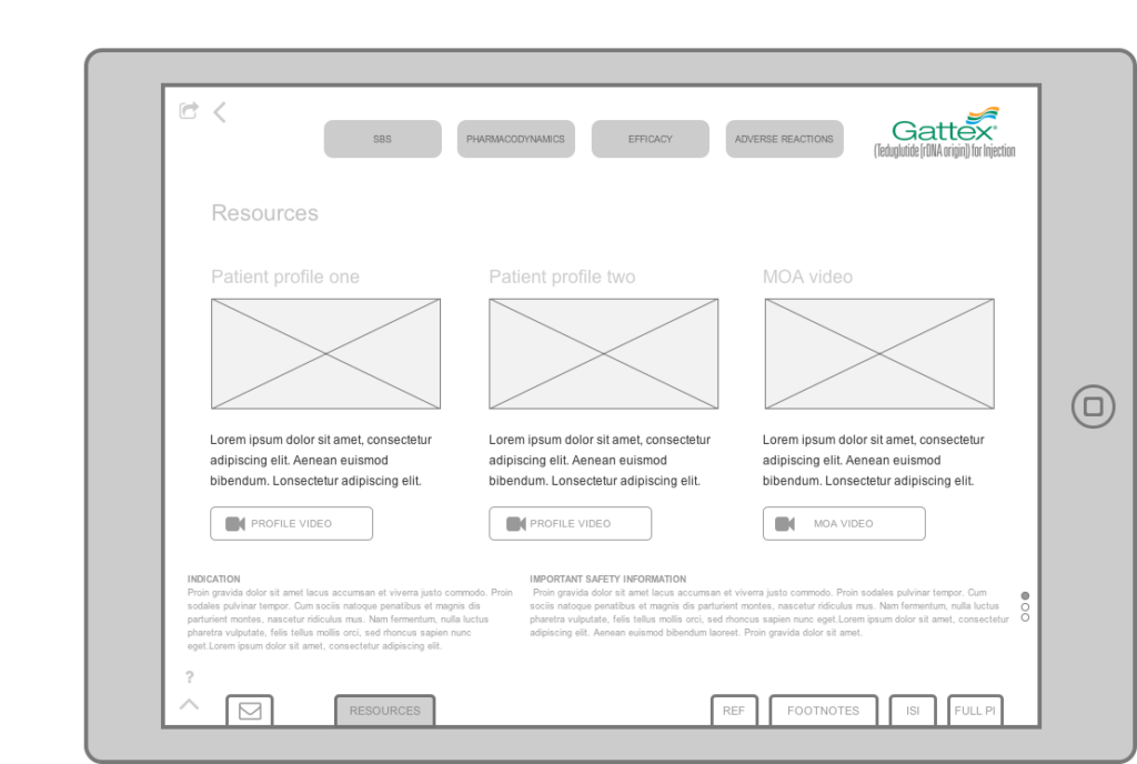
The wireframing stage was an important step because we had not yet won the business and it helped us to show the client that we had thought through everything before we earned the business.
We spent some time internally workshopping these ideas first, which was lead by UX. Then the wireframes were crafted, followed by an internal review with the team and client presentation.
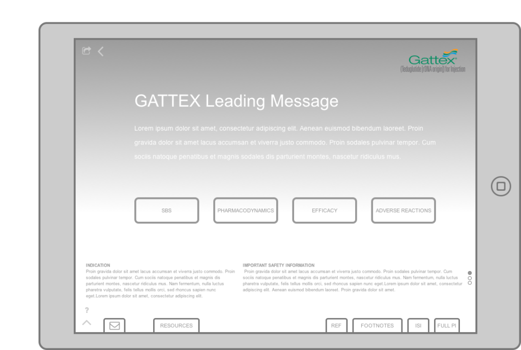
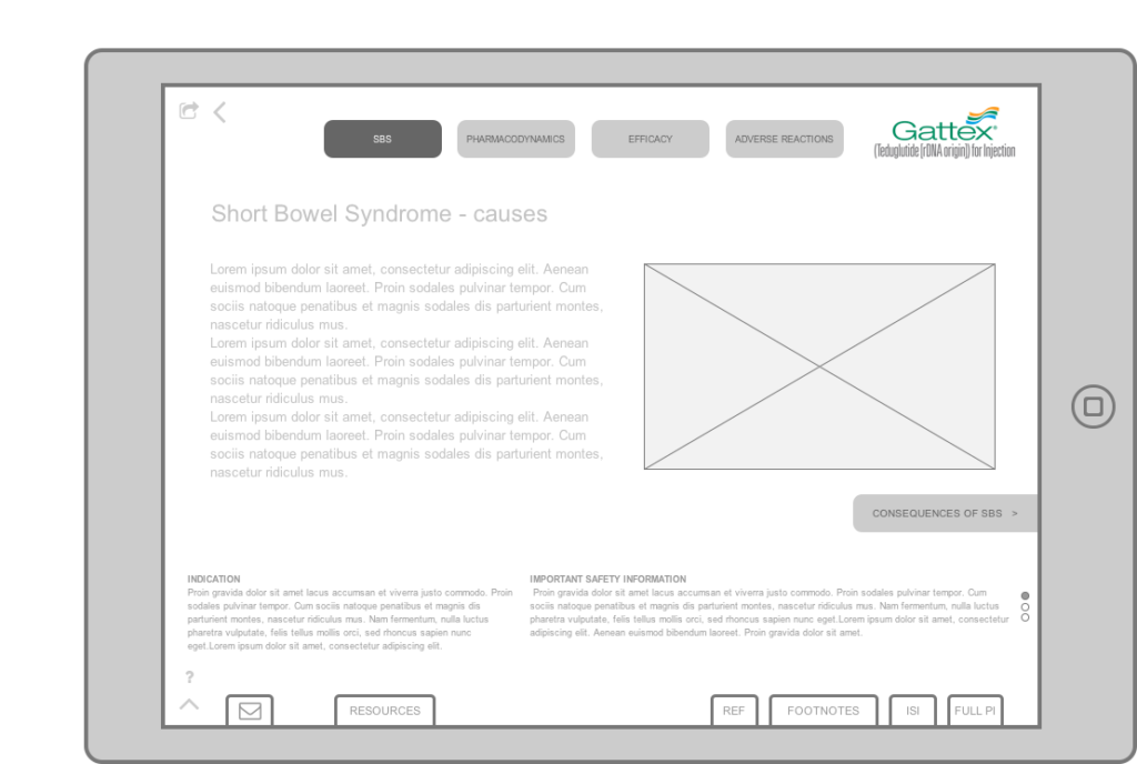


Navigation Options
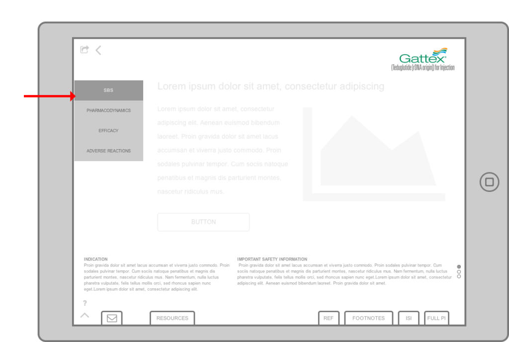
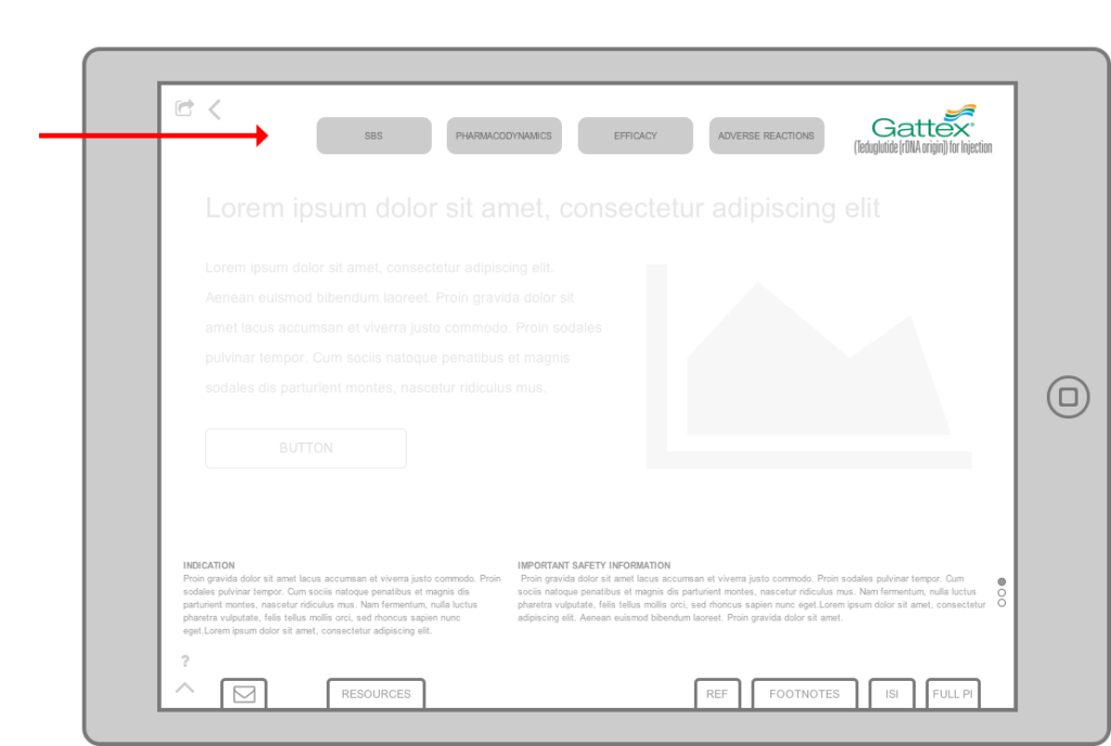
Navigation was something that had to be considered in great detail so options were created. One of the main challenges was that the sales force wasn’t comfortable detailing off of a digital presentation. The navigation options were designed to be easy to use so the sales reps could feel comfortable with the functionality. We wanted to encourage them to trust this new tool and depend on it.
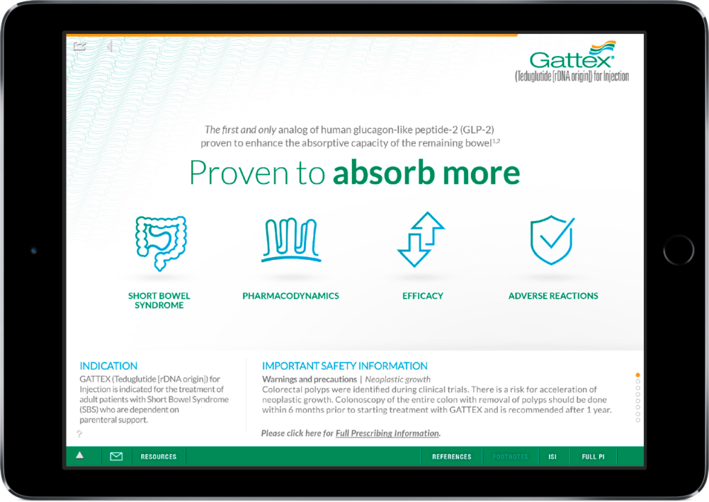
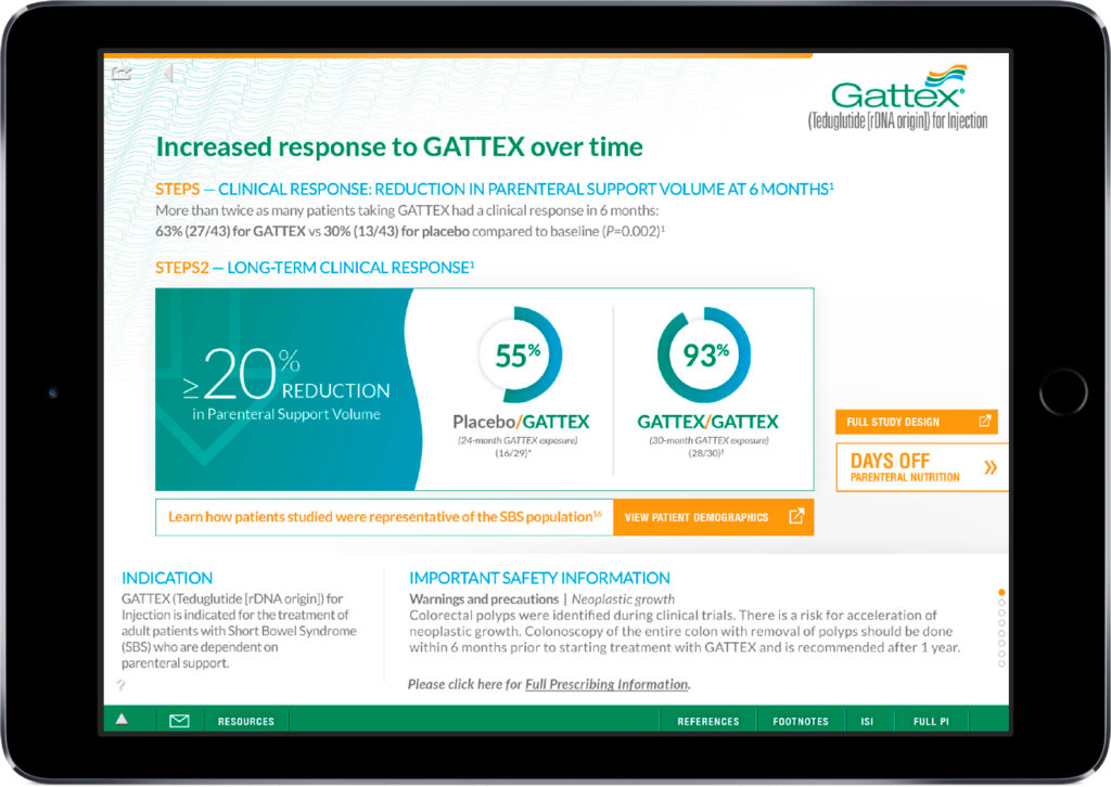
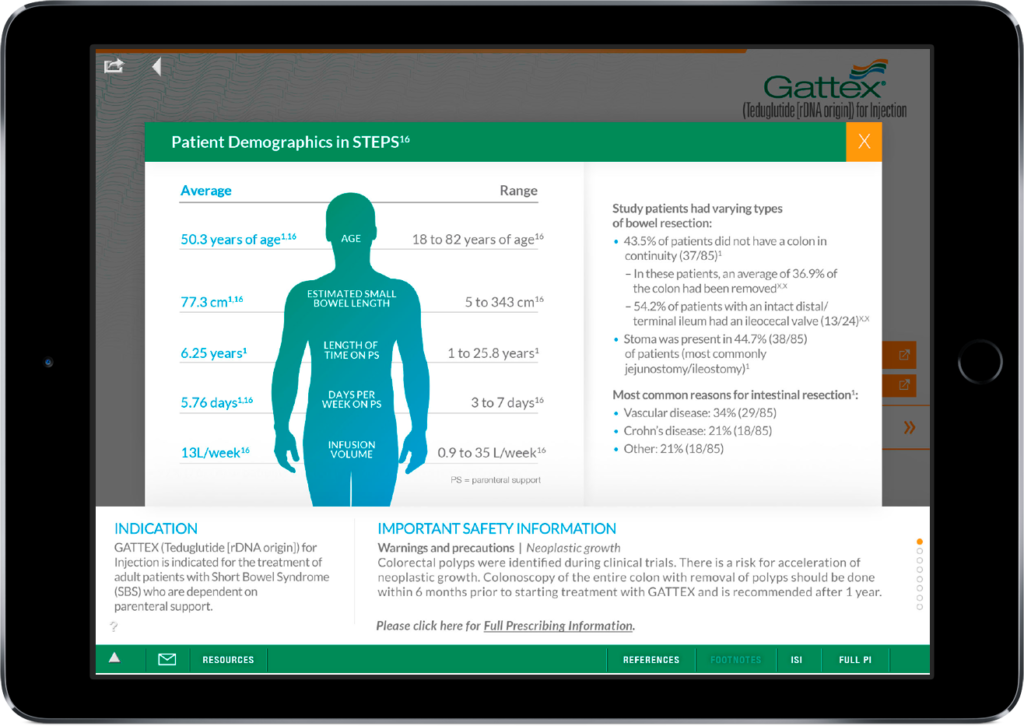
Final UI
The design was light and airy with a lot of white space allowing for the user to clearly see the content on the screen so that they can easily detail off of it. The UI was intentionally kept clinical and simple.
Post-Launch
Winning Business and Happy Clients
After working with Lialda on similar presentations Shire allowed us the opportunity to work on GATTEX which was exciting. The initial exercise of coming up with a concept and wireframes for the digital sales aid for the iPad was one of a few tests that we passed that ended up winning us the GATTEX business.